Event Overview
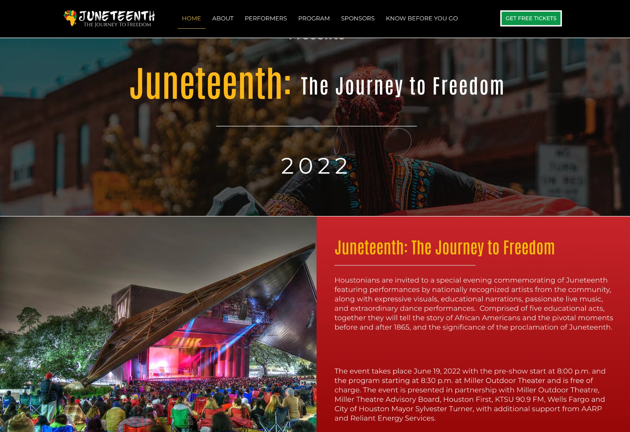
A branded homepage introduced the celebration, highlighted its purpose, and guided visitors toward event information and attendance details.
Brand Strategy & Identity · Creative Direction · Cultural Event Branding · Website Design & Development
Juneteenth is more than a celebration. It is a commemoration of freedom, resilience, cultural heritage, and the continued journey toward equality.
For Houston First Corporation’s Juneteenth: The Journey to Freedom celebration, Designs By Chimere was entrusted with developing a distinctive brand identity and digital experience that would honor the significance of the occasion while supporting the event’s public engagement.
Held at Houston’s Miller Outdoor Theatre, the free community celebration brought together music, dance, educational storytelling, and live performances to recognize pivotal moments in African American history.
The opportunity was to create more than an event logo or promotional website. It was to establish a cohesive visual presence that reflected the meaning behind the celebration and made the event accessible to the community.
Our creative direction centered on developing a visual identity that could communicate the historical importance of Juneteenth while capturing the energy, pride, and spirit of celebration.
The design process involved exploring multiple creative concepts, refining symbolism, and carefully considering how typography, color, and imagery could work together to tell a meaningful story.
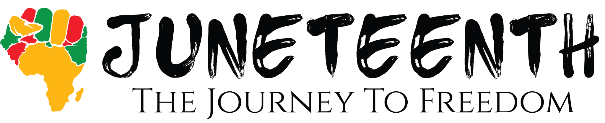
A central element of the final identity combined the silhouette of the African continent with a raised fist, creating a distinctive symbol representing heritage, strength, resilience, and freedom.
Typography was equally intentional. We explored typefaces created by African American designers, ultimately incorporating Tajamuka Script, a bold, expressive typeface whose name means “enough is enough.” Paired with the classic Cinzel typeface, the combination brought together contemporary cultural expression and a sense of historical significance.
The resulting identity was designed to feel powerful, recognizable, and adaptable across event communications.
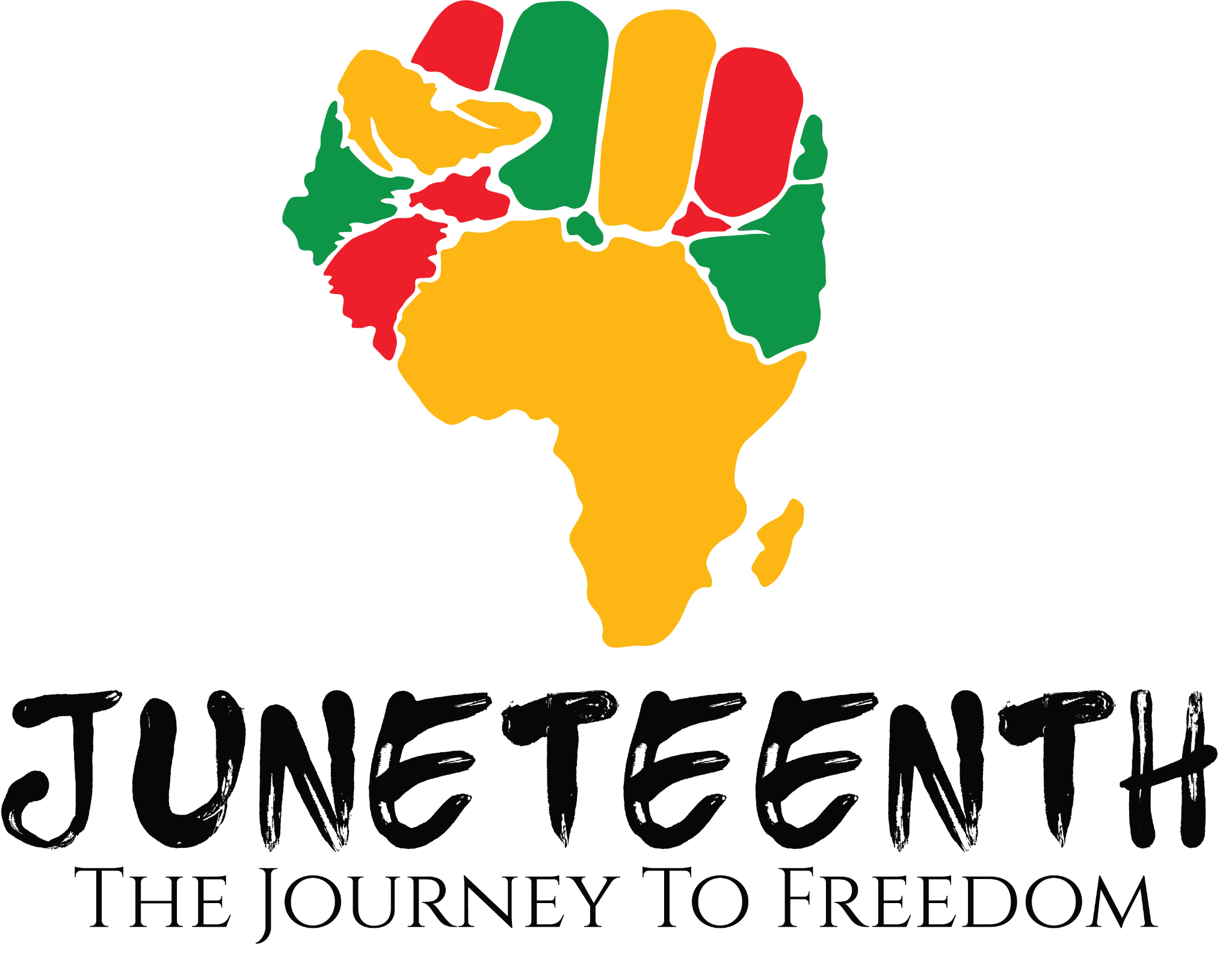
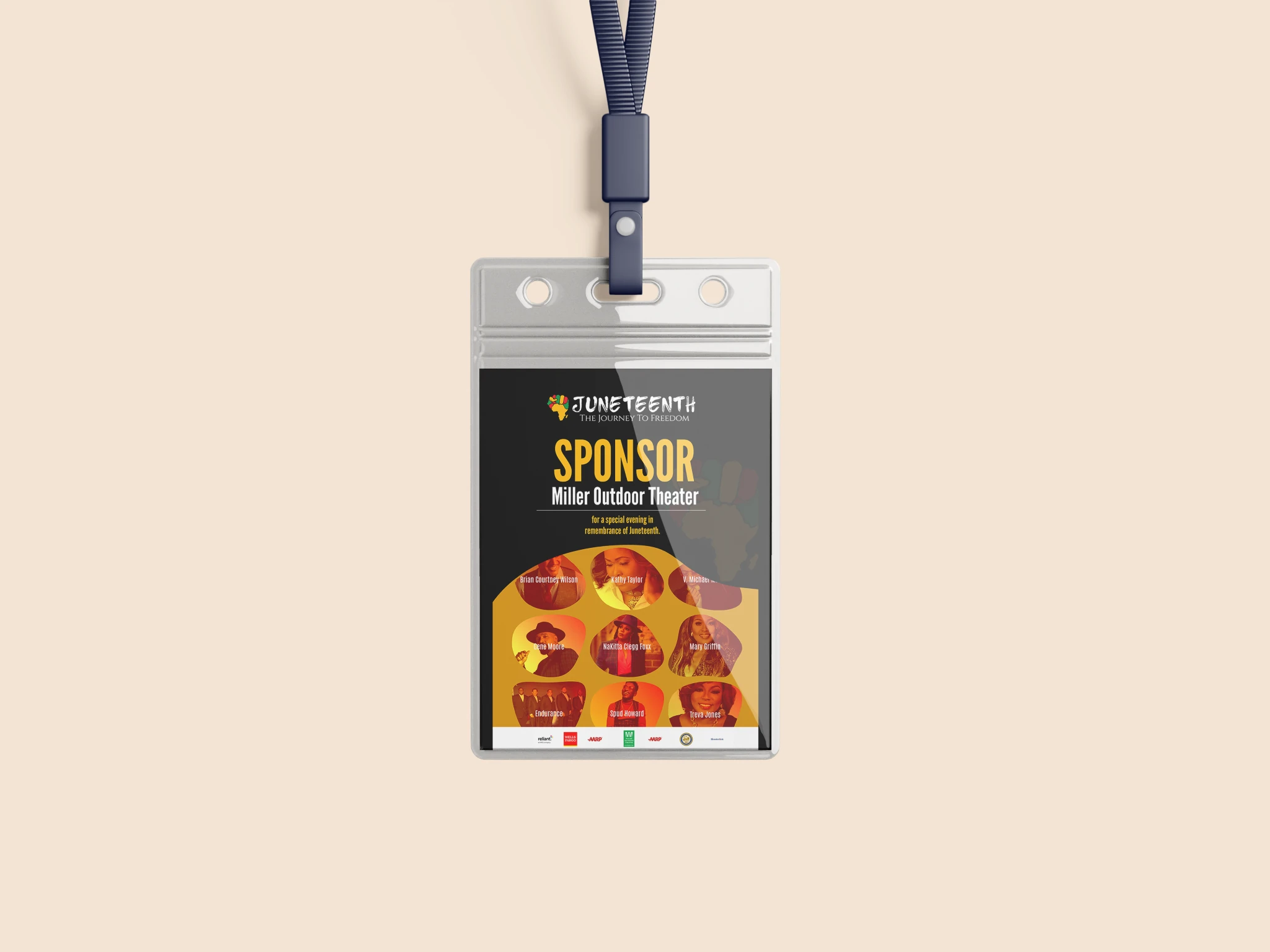
Beyond the primary logo, we developed a complete visual identity system to support consistent brand presentation across digital and promotional applications.
The identity included primary and alternate logo configurations, a standalone brand symbol, and a text-only variation, allowing the event’s branding to remain recognizable across different formats and placements.
A vibrant color palette of black, gold, green, and red reinforced the celebratory and cultural character of the event.
To ensure consistency, we also developed electronic brand guidelines outlining logo usage, color specifications, typography, imagery, and brand voice.
With the brand identity established, our partnership expanded into the design and development of a custom WordPress website.
The website served as a dedicated digital destination where attendees could discover the celebration, learn about featured performers, explore the program, recognize event sponsors, and access important information before attending.
Our approach prioritized clear navigation, consistent visual presentation, and an intuitive experience that made the event information easy to find.
The website was organized around the needs of the audience, connecting the event’s cultural storytelling with practical details that helped visitors plan their experience.
A branded homepage introduced the celebration, highlighted its purpose, and guided visitors toward event information and attendance details.
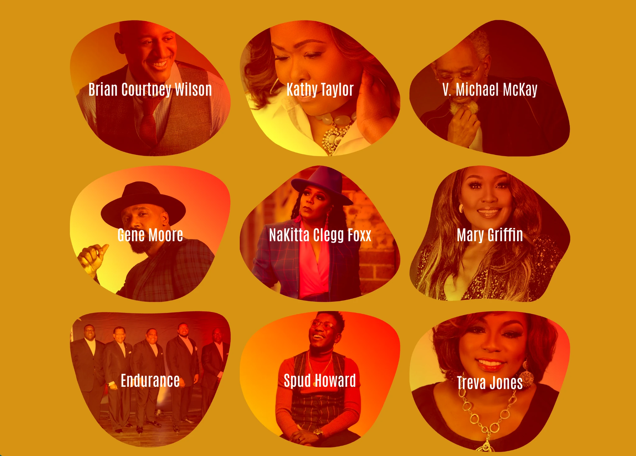
Dedicated sections presented featured artists, biographies, photography, and the event’s multi-act program, giving visitors a deeper understanding of the performances and historical storytelling.
Branded sponsor placements and linked logos provided visibility for participating organizations and community partners.
An informational section helped attendees prepare for the event by bringing essential details together in one accessible location.
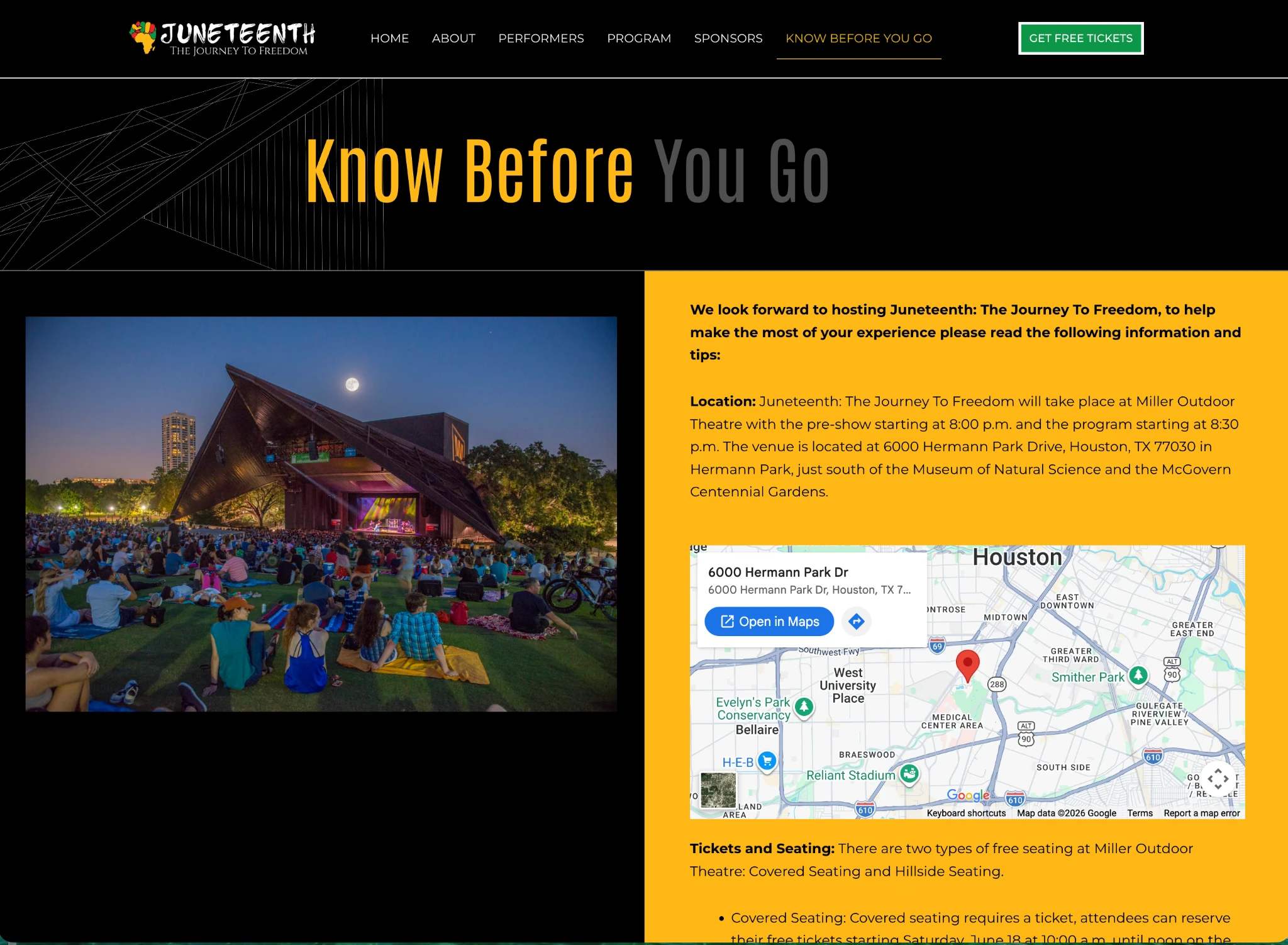
In addition to the website’s design and content structure, Designs By Chimere managed the technical implementation needed to bring the experience online.
This included WordPress development, staging deployments, hosting and domain configuration assistance, Google Tag Manager and analytics integration, and the successful launch of the website.
The result was a coordinated digital presence that extended the event’s identity beyond promotional materials into an accessible online experience.
The completed engagement brought together a culturally meaningful visual identity and a fully developed event website under one consistent brand experience.
The identity provided Houston First Corporation with a versatile visual system for event communications, while the website established a central location for performers, sponsors, program information, and attendee resources.
Together, these elements supported a more unified presentation of the celebration across brand and digital touchpoints.
For Designs By Chimere, the project demonstrated how thoughtful creative direction and digital execution can work together to support public-facing cultural initiatives.
Whether developing a brand for a business, nonprofit, community initiative, or cultural event, effective design begins with understanding what the experience represents and who it is intended to reach.
For Juneteenth: The Journey to Freedom, the objective was to honor a significant historical celebration while creating a recognizable identity and an accessible digital experience for the community.
When strategy, storytelling, and design work together, a brand can do more than promote an event. It can help communicate its significance and create a lasting impression.
Have an event, initiative, or organization that needs a stronger brand and digital presence? Let’s discuss how Designs By Chimere can help bring your vision to life.